P1]
In the world of data visualization, the scatter plot stands as a powerful and versatile tool. Its simplicity belies its ability to reveal hidden patterns, identify trends, and expose relationships within data sets. Whether you’re a seasoned data scientist or just starting to explore the world of analytics, understanding scatter plots is crucial for extracting meaningful insights from your data. This article will delve into the intricacies of scatter plots, exploring their purpose, construction, interpretation, and limitations, providing you with a comprehensive understanding of this fundamental visualization technique.
What is a Scatter Plot?
At its core, a scatter plot is a graphical representation of data points plotted on a two-dimensional Cartesian plane. Each point represents a single observation, with its position determined by the values of two variables. Typically, one variable is plotted on the horizontal axis (x-axis), and the other is plotted on the vertical axis (y-axis). The resulting distribution of points on the plot allows you to visually assess the relationship, or correlation, between these two variables.
Why Use a Scatter Plot?
Scatter plots offer a multitude of benefits, making them a valuable asset in data analysis:
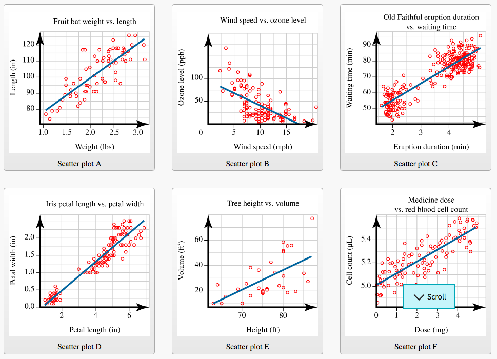
Identifying Correlations: The primary purpose of a scatter plot is to visually identify the presence and strength of a correlation between two variables. A correlation indicates a tendency for the variables to change together. This can be a positive correlation (as one variable increases, the other tends to increase), a negative correlation (as one variable increases, the other tends to decrease), or no correlation (the variables appear to be unrelated).

Detecting Patterns and Trends: Beyond simple correlations, scatter plots can reveal more complex patterns within the data. These patterns might include clusters of data points, non-linear relationships, or the presence of outliers.
Identifying Outliers: Outliers are data points that deviate significantly from the general trend or pattern of the data. Scatter plots make it easy to spot these outliers, which can be important for identifying errors in data collection, unusual events, or potentially interesting anomalies.
Exploring Relationships Between Variables: Scatter plots are invaluable for exploring the relationship between different variables in your data. They allow you to visually assess whether a relationship exists, and if so, the nature and strength of that relationship. This exploration can lead to further investigation and hypothesis testing.
Communicating Insights: Scatter plots are effective for communicating findings to a wider audience. A well-designed scatter plot can quickly and clearly convey complex relationships in a way that is easily understood.


Constructing a Scatter Plot:
Creating a scatter plot is a straightforward process. Here’s a step-by-step guide:
Choose Your Variables: Identify the two variables you want to analyze. One will be plotted on the x-axis (independent variable), and the other on the y-axis (dependent variable). The independent variable is often the one you believe influences the dependent variable.
Collect Your Data: Gather the data for each variable. Each observation should have a value for both variables.
Create the Axes: Draw the x-axis and y-axis. Choose appropriate scales for each axis that encompass the range of values for your variables.
Plot the Data Points: For each observation, find the corresponding values on the x-axis and y-axis and mark a point at their intersection.
Label the Axes: Clearly label each axis with the variable name and units of measurement.
**Add a
Leave a Reply