P1]
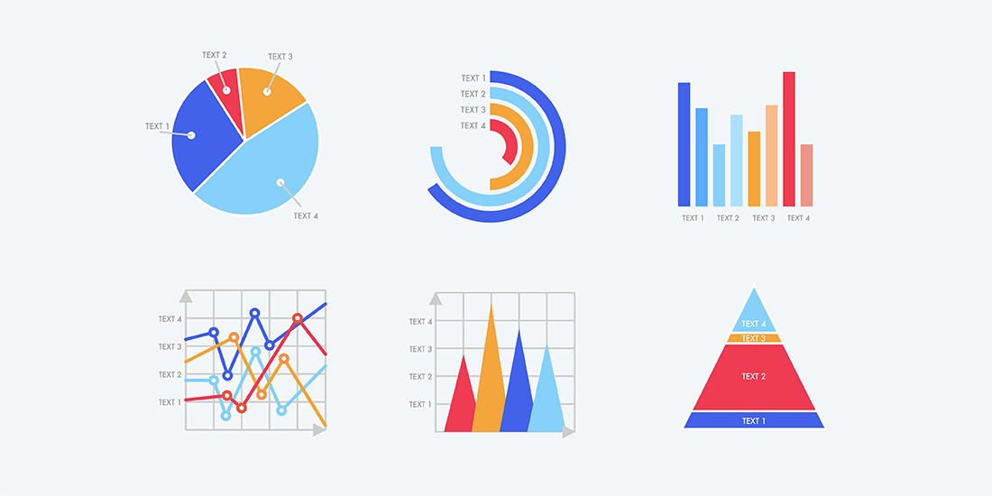
The pie chart, a seemingly simple graphic, is a powerful tool for visualizing data and conveying proportions at a glance. Shaped like a delicious pie sliced into segments, it represents the composition of a whole, with each slice representing a percentage of that whole. While often criticized for its limitations, the pie chart remains a popular and effective method for presenting data in specific contexts. This article delves into the nuances of pie charts, exploring their strengths, weaknesses, best use cases, and practical considerations for creating impactful visualizations.
Understanding the Anatomy of a Pie Chart
At its core, a pie chart is a circular statistical graphic divided into slices to illustrate numerical proportions. The entire circle represents 100% of the data, and each slice’s size is proportional to the percentage it represents. Let’s break down the key components:
- Slices (or Wedges): Each slice represents a category or component of the whole. The area of each slice corresponds to the proportion of that category.
- Labels: Each slice should be clearly labeled with the category name. This helps the audience quickly identify what each slice represents.
- Percentages: Ideally, each slice should also display the percentage of the whole that it represents. This provides precise numerical information.
- Color Coding: Different colors are typically used to distinguish between slices. Choosing appropriate colors is crucial for readability and visual appeal.
- **


Leave a Reply