P1]
In today’s data-rich world, we are constantly bombarded with information. From market trends to scientific discoveries, data is the lifeblood of decision-making. However, raw data, in its undigested form, is often overwhelming and difficult to interpret. This is where data visualization steps in, transforming complex datasets into easily understandable and actionable insights.
Data visualization is the graphical representation of information and data. By using visual elements like charts, graphs, maps, and diagrams, it allows us to see trends, outliers, and patterns that might be hidden within spreadsheets and databases. It’s not just about making data look pretty; it’s about communicating information effectively and driving informed decisions.
Why is Data Visualization Important?
The importance of data visualization stems from its ability to bridge the gap between raw data and human understanding. Here’s why it’s crucial in today’s landscape:
- Improved Comprehension: Humans are visual creatures. We process visual information much faster and more effectively than text or numbers. Data visualization leverages this natural ability to make complex information more accessible and understandable.
- Enhanced Pattern Recognition: Visual representations help us identify patterns, trends, and correlations that would be difficult to discern in raw data. This can lead to valuable insights and discoveries.
- Effective Communication: Data visualizations are powerful tools for communicating insights to a wider audience. They can be used to present findings to stakeholders, inform the public, and even drive policy decisions.
- Faster Decision-Making: By providing a clear and concise overview of data, visualizations enable faster and more informed decision-making. This is especially important in fast-paced environments where timely action is crucial.
- Identification of Outliers: Visualizations can quickly highlight outliers and anomalies in data, which can be indicative of errors, opportunities, or potential problems.
- Storytelling with Data: Data visualization allows us to tell stories with data, providing context and narrative that makes the information more engaging and memorable.

Types of Data Visualizations:
The world of data visualization is vast and diverse, with a wide range of techniques available to suit different types of data and analytical goals. Here are some of the most common and effective types of visualizations:
- Bar Charts: Ideal for comparing categorical data, bar charts use bars of different lengths to represent the values of each category. They are simple, versatile, and easy to understand.
- Line Charts: Line charts are excellent for displaying trends over time. They connect data points with lines to show how values change over a continuous period.
- Pie Charts: Pie charts represent proportions of a whole. They are useful for showing the relative contribution of different categories to a total value. However, they can become cluttered with too many categories.
- Scatter Plots: Scatter plots are used to explore the relationship between two variables. Each data point is represented as a dot on the chart, allowing you to identify correlations and clusters.
- Histograms: Histograms display the distribution of a single variable. They divide the data into bins and show the frequency of values within each bin.
- Heatmaps: Heatmaps use color to represent the magnitude of data values. They are useful for visualizing large datasets and identifying patterns across multiple dimensions.
- Geographic Maps: Geographic maps are used to display data that is associated with geographic locations. They can be used to visualize population density, sales by region, or any other spatially-related data.
- Tree Maps: Tree maps display hierarchical data as nested rectangles. The size of each rectangle represents the value of the corresponding category.
- Word Clouds: Word clouds visually represent the frequency of words in a text. The size of each word is proportional to its frequency.
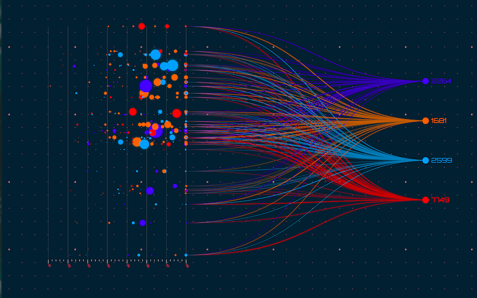
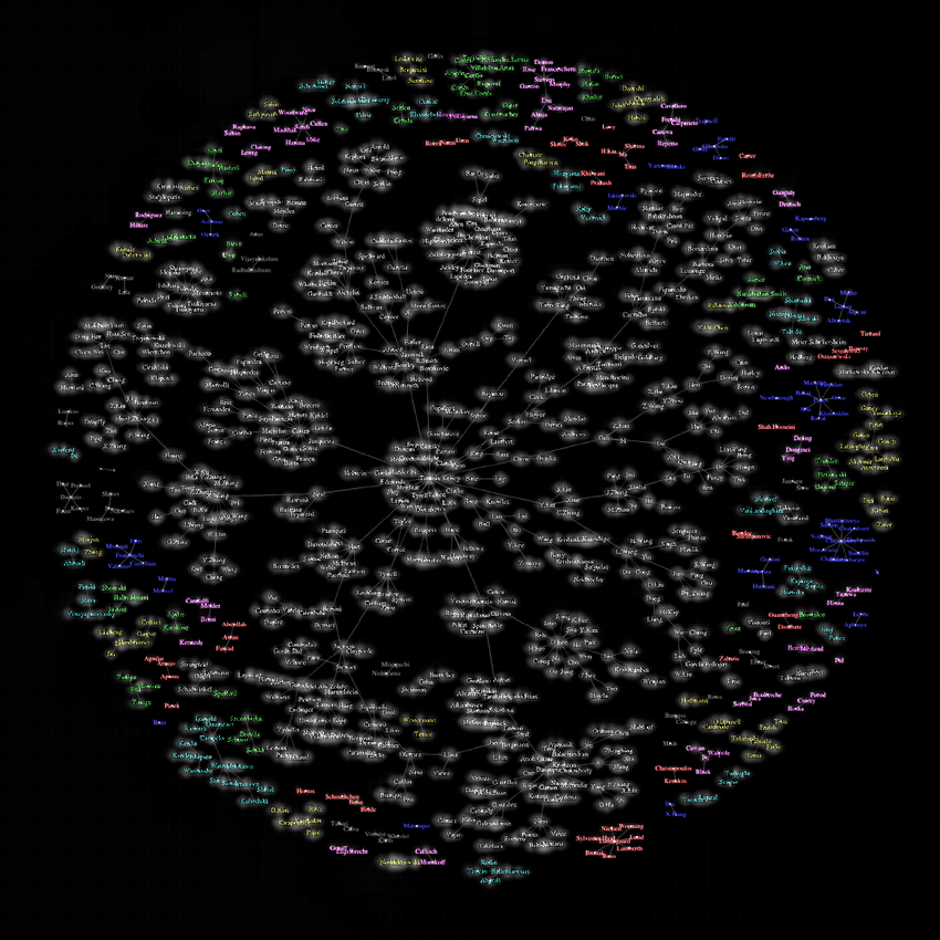
- Network Diagrams: Network diagrams visualize relationships between entities. They are used to represent social networks, communication networks, and other complex systems.

Best Practices for Effective Data Visualization:
Creating effective data visualizations requires more than just choosing the right chart type. Here are some best practices to keep in mind:
- Know Your Audience: Consider the knowledge and background of your audience when designing your visualizations. Tailor the complexity and level of detail to their needs.
- Define Your Purpose: What message are you trying to convey with your visualization? Clearly define your purpose before you start designing.
- Choose the Right Chart Type: Select the chart type that is best suited for the type of data you are working with and the message you are trying to communicate.
- Keep it Simple: Avoid clutter and unnecessary complexity. Focus on presenting the key information in a clear and concise manner.
- Use Color Strategically: Use color to highlight important data points, distinguish between categories, and create visual appeal. However, avoid using too many colors, as this can be distracting.
- Label Everything Clearly: Label your axes, data points, and legends clearly and accurately.
- Provide Context: Provide sufficient context to help your audience understand the data and its significance.
- Tell a Story: Use your visualizations to tell a story with the data. Highlight key insights and draw conclusions.
- Test and Iterate: Get feedback on your visualizations and iterate on your designs based on the feedback you receive.
- Ensure Accessibility: Design your visualizations to be accessible to people with disabilities. Use sufficient contrast, provide alternative text for images, and avoid relying solely on color to convey information.
Tools for Data Visualization:
Numerous tools are available for creating data visualizations, ranging from simple spreadsheet software to sophisticated data analytics platforms. Here are some popular options:
- Microsoft Excel: A widely used spreadsheet program with basic charting capabilities.
- Google Sheets: A free, web-based spreadsheet program with similar charting capabilities to Excel.
- Tableau: A powerful data visualization and business intelligence platform.
- Power BI: Microsoft’s business analytics service that provides interactive visualizations and business intelligence capabilities.
- Python (with libraries like Matplotlib, Seaborn, and Plotly): A versatile programming language with powerful libraries for creating custom visualizations.
- R (with libraries like ggplot2): A statistical computing language with excellent visualization capabilities.
- D3.js: A JavaScript library for creating interactive and dynamic data visualizations in web browsers.
The Future of Data Visualization:
Data visualization is a rapidly evolving field, driven by advancements in technology and the increasing volume and complexity of data. Some key trends shaping the future of data visualization include:
- Interactive Visualizations: Interactive visualizations allow users to explore data and uncover insights on their own.
- Real-Time Dashboards: Real-time dashboards provide up-to-the-minute views of key performance indicators.
- Augmented Reality (AR) and Virtual Reality (VR): AR and VR technologies are being used to create immersive data visualizations that allow users to interact with data in new and exciting ways.
- AI-Powered Visualization: Artificial intelligence is being used to automate the process of creating visualizations and to generate insights from data.
- Data Storytelling: The focus is shifting from simply presenting data to telling compelling stories with data.
Conclusion:
Data visualization is an essential tool for understanding and communicating information in today’s data-driven world. By transforming raw data into meaningful visuals, we can unlock valuable insights, make better decisions, and tell compelling stories. As the volume and complexity of data continue to grow, the importance of data visualization will only increase. By mastering the art and science of data visualization, we can empower ourselves and others to make sense of the world around us.
FAQ: Data Visualization
Q1: What is the difference between data visualization and infographics?
A: While both involve visual representations of information, data visualization focuses on representing data accurately and objectively, often using charts and graphs. Infographics, on the other hand, prioritize storytelling and can use a wider range of visual elements, including illustrations and icons, to convey a specific message.
Q2: What is the best chart type for comparing two sets of data?
A: Bar charts are generally a good choice for comparing two or more sets of categorical data. Line charts can be used to compare trends over time for multiple datasets.
Q3: How do I avoid misleading visualizations?
A: Always start your axes at zero, use appropriate scales, avoid truncating axes, and provide clear and accurate labels. Be mindful of the potential for bias and ensure that your visualizations accurately reflect the underlying data.
Q4: What are some common mistakes to avoid when creating data visualizations?
A: Some common mistakes include using too many colors, cluttering the visualization with unnecessary elements, choosing the wrong chart type, and failing to provide sufficient context.
Q5: Can I use data visualization for qualitative data?
A: Yes, you can use data visualization for qualitative data. Techniques like word clouds, network diagrams, and thematic analysis can be used to visualize qualitative information.
Q6: How can I learn more about data visualization?
A: There are many resources available for learning about data visualization, including online courses, books, tutorials, and workshops. Experimenting with different tools and techniques is also a great way to learn.
Q7: What is the role of color in data visualization?
A: Color plays a crucial role in data visualization. It can be used to highlight important data points, distinguish between categories, and create visual appeal. However, it’s important to use color strategically and avoid using too many colors, as this can be distracting. Consider accessibility and colorblindness when choosing color palettes.
Q8: How do I make my data visualizations accessible?
A: Ensure sufficient contrast between text and background colors. Provide alternative text for images. Avoid relying solely on color to convey information. Use clear and concise labels. Consider using tools that support accessibility features.
Q9: What are some ethical considerations in data visualization?
A: It’s important to present data accurately and avoid misleading your audience. Be transparent about your data sources and methods. Avoid using visualizations to manipulate or deceive. Consider the potential impact of your visualizations on society.
Q10: How do I choose the right data visualization tool?
A: Consider your budget, technical skills, and the types of visualizations you need to create. Some tools are more user-friendly than others. Experiment with different tools to find the one that best suits your needs.
By understanding the principles and techniques of data visualization, you can transform raw data into meaningful insights and communicate your findings effectively. Embrace the power of visuals to unlock the hidden stories within your data and drive informed decisions.
Leave a Reply