P1]
In today’s data-rich world, businesses are constantly bombarded with information. The challenge lies not in collecting data, but in extracting meaningful insights and using them to drive informed decisions. This is where interactive dashboards come into play, transforming raw data into visually compelling stories that empower users to explore, analyze, and act.
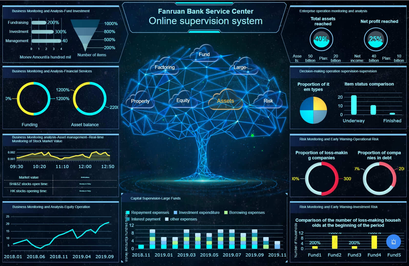
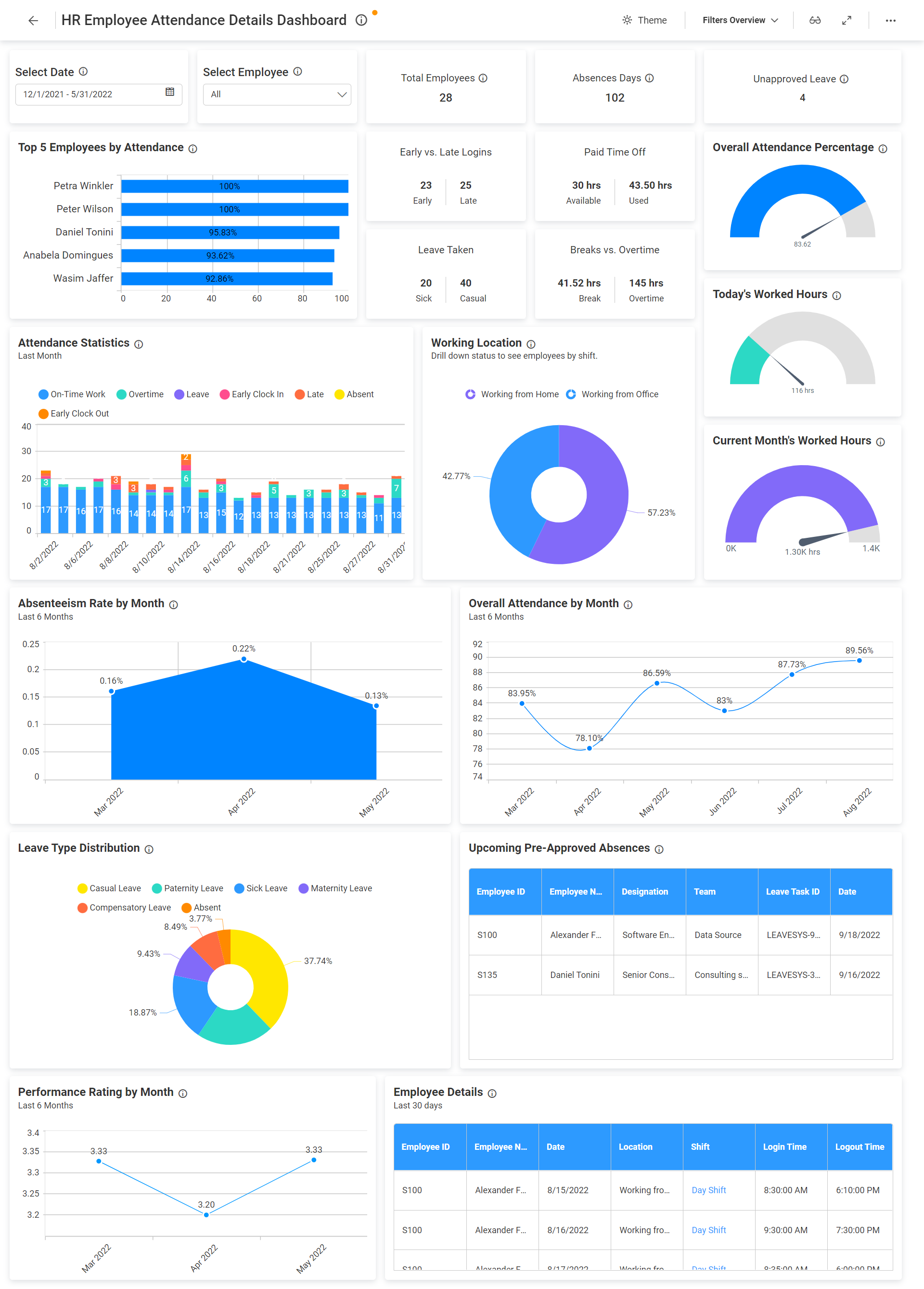
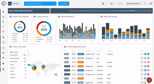
Interactive dashboards are more than just static charts and graphs. They are dynamic interfaces that allow users to actively engage with data, drill down into specific details, filter results, and explore different perspectives. This interactivity fosters a deeper understanding of the underlying trends and patterns, leading to more effective decision-making and improved business outcomes.
What Makes a Dashboard Interactive?
The key differentiator between a static report and an interactive dashboard is the ability for users to actively manipulate and explore the data. This is achieved through a range of interactive elements, including:
- Filters: Allow users to narrow down the data displayed based on specific criteria, such as date ranges, product categories, geographic locations, or customer segments.
- Drill-Downs: Enable users to navigate from a high-level overview to more granular details, providing a deeper understanding of the factors contributing to overall trends. For example, clicking on a regional sales figure might reveal individual store performance within that region.
- Sorting: Allow users to arrange data in ascending or descending order based on specific metrics, making it easier to identify top performers, outliers, and areas requiring attention.
- Tooltips: Provide contextual information and additional details when hovering over specific data points, enhancing the user’s understanding of the displayed information.
- Dynamic Charts and Graphs: Respond to user interactions, updating in real-time to reflect the chosen filters and drill-downs, providing a dynamic and engaging experience.
- Parameter Controls: Allow users to adjust underlying parameters or assumptions within the dashboard, enabling them to conduct "what-if" scenarios and explore the potential impact of different variables.
- Cross-Filtering: Allows users to select a data point in one chart or graph, which then automatically filters the data displayed in other related charts and graphs, revealing connections and dependencies between different data sets.
Benefits of Interactive Dashboards:
The advantages of using interactive dashboards are numerous, impacting various aspects of business operations and decision-making:

- Improved Data Understanding: Interactive dashboards empower users to explore data from different angles, uncovering hidden patterns and insights that might be missed in static reports. The ability to drill down, filter, and sort data fosters a deeper understanding of the underlying trends and drivers.
- Enhanced Decision-Making: By providing a comprehensive and interactive view of key performance indicators (KPIs), interactive dashboards enable users to make more informed decisions based on real-time data and insights. This leads to more strategic and effective business outcomes.
- Increased Efficiency: Interactive dashboards eliminate the need for manual data analysis and reporting, freeing up valuable time for users to focus on more strategic tasks. The ability to quickly access and analyze data reduces the time required to identify problems, opportunities, and potential solutions.
- Better Collaboration: Interactive dashboards can be easily shared and collaborated on, fostering a more data-driven culture within the organization. Users can easily share their insights and findings with colleagues, promoting better communication and alignment.
- Real-Time Monitoring: Interactive dashboards provide a real-time view of key business metrics, allowing users to monitor performance, identify potential issues, and take corrective action before they escalate. This proactive approach helps to improve overall efficiency and responsiveness.
- Personalized Experience: Interactive dashboards can be customized to meet the specific needs of different users and departments, providing a personalized experience that enhances user engagement and adoption.
- Data Storytelling: Interactive dashboards allow users to create compelling data stories that communicate complex information in a clear and concise manner. The visual nature of dashboards makes it easier for users to understand and retain information.
Designing Effective Interactive Dashboards:
Creating an effective interactive dashboard requires careful planning and attention to detail. Here are some key considerations:
- Define the Purpose: Clearly define the purpose of the dashboard and the specific questions it should answer. This will help to focus the design and ensure that the dashboard provides relevant and actionable insights.
- Identify the Target Audience: Understand the needs and skill levels of the target audience. The dashboard should be designed to be intuitive and easy to use, even for users with limited technical expertise.
- Choose the Right Visualizations: Select appropriate charts and graphs to effectively communicate the data. Consider the type of data being displayed and the message you want to convey. Avoid using overly complex visualizations that can confuse users.
- Prioritize Key Metrics: Focus on displaying the most important KPIs and metrics that are relevant to the purpose of the dashboard. Avoid cluttering the dashboard with too much information.
- Use Clear and Concise Labels: Use clear and concise labels to identify the data being displayed. Avoid using jargon or technical terms that users may not understand.
- Ensure Data Accuracy: Ensure that the data used in the dashboard is accurate and up-to-date. Errors in the data can lead to incorrect insights and poor decision-making.
- Optimize for Performance: Optimize the dashboard for performance to ensure that it loads quickly and responds smoothly to user interactions.
- Test and Iterate: Test the dashboard with users and gather feedback to identify areas for improvement. Iterate on the design based on user feedback to create a dashboard that is truly effective and user-friendly.
Tools for Building Interactive Dashboards:
A variety of tools are available for building interactive dashboards, ranging from simple spreadsheet software to sophisticated business intelligence platforms. Some popular options include:
- Microsoft Power BI: A powerful business intelligence platform that offers a wide range of features for creating interactive dashboards and reports.
- Tableau: A leading data visualization tool that enables users to create stunning and interactive dashboards with ease.
- Qlik Sense: A data analytics platform that uses associative data indexing to allow users to explore data from different angles.
- Google Data Studio: A free and easy-to-use data visualization tool that integrates seamlessly with other Google services.
- Excel: While primarily a spreadsheet program, Excel offers basic charting and filtering capabilities that can be used to create simple interactive dashboards.
Conclusion:
Interactive dashboards are essential tools for businesses looking to unlock the power of their data and drive informed decision-making. By providing a dynamic and engaging way to explore data, interactive dashboards empower users to uncover hidden insights, monitor performance, and take proactive action. By carefully planning the design and selecting the right tools, organizations can create interactive dashboards that deliver significant business value.
FAQ:
Q1: What is the difference between a report and a dashboard?
A: A report typically presents a static snapshot of data, often in a tabular format. A dashboard, on the other hand, provides a dynamic and interactive view of key performance indicators (KPIs), allowing users to explore data from different angles and drill down into specific details.
Q2: Who should use interactive dashboards?
A: Interactive dashboards are beneficial for a wide range of users, including executives, managers, analysts, and front-line employees. Anyone who needs to access and analyze data to make informed decisions can benefit from using interactive dashboards.
Q3: How much does it cost to build an interactive dashboard?
A: The cost of building an interactive dashboard can vary depending on the complexity of the dashboard, the chosen tools, and the level of expertise required. Simple dashboards can be created using free tools like Google Data Studio or basic features in Excel. More complex dashboards may require the use of commercial business intelligence platforms like Power BI or Tableau, which can involve subscription fees and implementation costs.
Q4: What skills are needed to build interactive dashboards?
A: Building interactive dashboards requires a combination of technical and analytical skills. Some key skills include data analysis, data visualization, dashboard design, and proficiency in the chosen dashboarding tool.
Q5: How can I ensure that my interactive dashboard is effective?
A: To ensure that your interactive dashboard is effective, you should:
- Clearly define the purpose of the dashboard.
- Identify the target audience and their needs.
- Choose appropriate visualizations to effectively communicate the data.
- Prioritize key metrics and avoid clutter.
- Ensure data accuracy and timeliness.
- Test and iterate on the design based on user feedback.
Q6: What are some common mistakes to avoid when building interactive dashboards?
A: Some common mistakes to avoid include:
- Cluttering the dashboard with too much information.
- Using overly complex visualizations.
- Ignoring the needs of the target audience.
- Failing to ensure data accuracy.
- Not testing and iterating on the design.
Q7: How can I measure the success of my interactive dashboard?
A: You can measure the success of your interactive dashboard by tracking key metrics such as:
- User adoption rate.
- Time spent using the dashboard.
- Number of decisions made based on dashboard insights.
- Improved business outcomes resulting from the use of the dashboard.
By carefully considering these factors and continuously improving your dashboard based on user feedback, you can create a powerful tool that drives data-driven decision-making and delivers significant business value.
Leave a Reply