P1]
Cross-tab reports, also known as contingency tables or pivot tables, are powerful analytical tools used to summarize and analyze the relationships between two or more categorical variables. They provide a clear and concise way to visualize patterns, trends, and associations within data, making them invaluable for business intelligence, market research, and various other data-driven fields. This article will delve into the intricacies of cross-tab reports, exploring their purpose, structure, creation, interpretation, and applications.
Understanding the Fundamentals
At its core, a cross-tab report is a matrix that displays the frequency distribution of two or more variables. It essentially counts how many times each combination of categories occurs in a dataset. Think of it as a multi-dimensional frequency table.
- Variables: These are the categorical attributes you want to analyze. Examples include gender, product category, customer segment, region, and satisfaction level.
- Rows and Columns: Typically, one variable is displayed along the rows of the table, and another is displayed along the columns.
- Cells: Each cell in the table represents the intersection of a specific row and column category. The value within the cell indicates the number of occurrences (or counts) where those categories coincide.
The Structure of a Cross-Tab Report
A typical cross-tab report consists of the following key components:
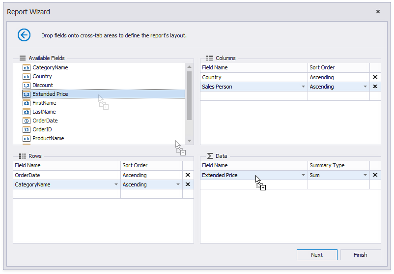
- Row Variables: These are the categories displayed along the rows of the table. They represent one of the variables you’re analyzing.
- Column Variables: These are the categories displayed along the columns of the table. They represent the other variable you’re analyzing.
- Data Cells: These are the cells within the table that contain the actual data. The data is usually represented as counts (frequencies), but can also be percentages, averages, or other summary statistics.
- Row Totals: These are the sums of the data cells for each row. They provide a total count for each category in the row variable.
- Column Totals: These are the sums of the data cells for each column. They provide a total count for each category in the column variable.
- Grand Total: This is the sum of all the data cells in the table. It represents the total number of observations in the dataset.
S(3k2keh4g4jlx54caqepgbvob))/images/crosstabreport01.png)
Creating a Cross-Tab Report: A Step-by-Step Guide
Creating a cross-tab report involves selecting the relevant variables, defining the rows and columns, and populating the data cells. Here’s a general outline of the process:

- Identify the Research Question: What are you trying to understand or discover from the data? This will guide your choice of variables.
- Select the Variables: Choose the two or more categorical variables that are relevant to your research question.
- Choose Row and Column Variables: Decide which variable will be displayed along the rows and which will be displayed along the columns. The choice may depend on which variable you want to emphasize or which is considered the independent variable.
- Data Preparation: Ensure your data is clean and properly formatted. This may involve handling missing values, correcting errors, and categorizing continuous variables if necessary.
- Software Implementation: Use spreadsheet software (e.g., Excel, Google Sheets), statistical software (e.g., SPSS, R), or business intelligence tools (e.g., Tableau, Power BI) to create the cross-tab report.
- Populate the Data Cells: The software will automatically count the occurrences of each combination of categories and populate the data cells accordingly.
- Add Row and Column Totals: Most software packages provide options to automatically calculate and display row and column totals.
- Format and Customize: Adjust the appearance of the table to improve readability and clarity. This may involve changing font sizes, adding borders, and using color coding.
Interpreting a Cross-Tab Report: Unveiling Insights
Once you have created a cross-tab report, the next step is to interpret the data and extract meaningful insights. Here are some key aspects to consider:
- Overall Distribution: Examine the row and column totals to understand the overall distribution of each variable. Are there any dominant categories?
- Cell Frequencies: Focus on the individual cell frequencies to identify patterns and associations between the variables. Are there any cells with significantly higher or lower counts than expected?
- Percentages: Calculate row percentages, column percentages, or total percentages to normalize the data and facilitate comparisons. Row percentages show the proportion of each row category that falls into each column category. Column percentages show the proportion of each column category that falls into each row category. Total percentages show the proportion of the entire dataset that falls into each cell.
- Statistical Significance: Use statistical tests, such as the Chi-Square test, to determine whether the observed associations between the variables are statistically significant. This helps to rule out the possibility that the observed patterns are due to chance.
- Visualizations: Supplement the cross-tab report with visualizations, such as bar charts or heatmaps, to further illustrate the relationships between the variables.
- Contextual Knowledge: Consider the context of the data and your domain expertise to interpret the findings in a meaningful way.
Applications of Cross-Tab Reports
Cross-tab reports have a wide range of applications across various industries and disciplines:
- Market Research: Analyzing customer demographics, preferences, and purchasing behavior.
- Healthcare: Studying the relationship between risk factors and disease prevalence.
- Education: Examining the correlation between teaching methods and student performance.
- Finance: Analyzing the relationship between investment strategies and portfolio returns.
- Human Resources: Evaluating employee demographics, satisfaction levels, and performance metrics.
- Political Science: Analyzing voting patterns and public opinion polls.
- Manufacturing: Assessing the relationship between production processes and product quality.
Advantages of Using Cross-Tab Reports
- Simplicity and Clarity: Easy to understand and interpret, even for non-technical users.
- Data Summarization: Provides a concise summary of large datasets.
- Relationship Discovery: Helps to identify patterns, trends, and associations between variables.
- Decision Making: Supports data-driven decision making in various fields.
- Versatility: Applicable to a wide range of data types and research questions.
Limitations of Using Cross-Tab Reports
- Limited to Categorical Variables: Primarily designed for analyzing categorical data.
- Complexity with Multiple Variables: Can become difficult to interpret with too many variables.
- Correlation vs. Causation: Does not prove causation, only correlation.
- Simpson’s Paradox: Can be misleading if confounding variables are not considered.
Example Scenario: Analyzing Customer Satisfaction
Let’s say you work for a retail company and want to analyze customer satisfaction levels based on product category. You have collected data on customer satisfaction (High, Medium, Low) and the product category they purchased (Clothing, Electronics, Home Goods). You can create a cross-tab report with Product Category as the row variable and Customer Satisfaction as the column variable. The cells would then show the number of customers who purchased each product category and reported each level of satisfaction. This would allow you to identify which product categories have the highest and lowest satisfaction levels and potentially investigate the reasons behind these differences.
FAQ
Q: What is the difference between a cross-tab report and a frequency distribution?
A: A frequency distribution shows the number of occurrences of each category for a single variable. A cross-tab report shows the number of occurrences of each combination of categories for two or more variables.
Q: How do I choose which variable to put on the rows and which on the columns?
A: There’s no strict rule, but consider which variable is more likely to be the independent variable or the variable you want to emphasize. Also, consider the readability of the table. Sometimes, one arrangement is more visually appealing and easier to understand than the other.
Q: How do I deal with missing values in my data when creating a cross-tab report?
A: There are several ways to handle missing values:
- Exclude: Remove rows with missing values. This is suitable if the number of missing values is small.
- Impute: Replace missing values with estimated values (e.g., the mean or mode). This can introduce bias if not done carefully.
- Create a "Missing" Category: Treat missing values as a separate category. This can be useful if missingness itself is informative.
Q: What is the Chi-Square test, and why is it used with cross-tab reports?
A: The Chi-Square test is a statistical test used to determine whether there is a statistically significant association between two categorical variables. It compares the observed frequencies in the cross-tab report to the expected frequencies under the assumption that the variables are independent. A significant Chi-Square test suggests that the variables are related.
Q: Can I use cross-tab reports with more than two variables?
A: Yes, you can create cross-tab reports with more than two variables, but they become increasingly complex to interpret. You can use multi-dimensional cross-tab reports or create a series of two-way cross-tab reports to explore the relationships between different pairs of variables.
Conclusion
Cross-tab reports are a valuable tool for summarizing and analyzing categorical data. By understanding their structure, creation, interpretation, and applications, you can leverage them to gain valuable insights, identify patterns, and make data-driven decisions. While they have limitations, their simplicity, clarity, and versatility make them an essential component of any data analyst’s toolkit. Remember to always consider the context of your data and use appropriate statistical tests to validate your findings. By mastering the art of cross-tab reports, you can unlock the power of your data and drive meaningful results.
Leave a Reply