P1]
Bubble charts, often considered an extension of scatter plots, are powerful visualization tools that allow you to represent three or more dimensions of data in a single, easily digestible chart. They go beyond simply plotting points on a graph by using the size of the bubbles to represent a third variable, and often color to represent a fourth or even fifth. This capability makes them ideal for uncovering patterns, identifying outliers, and communicating complex relationships within your data.
This article will delve into the intricacies of bubble charts, exploring their strengths, weaknesses, best practices for creation, and offering practical examples to illustrate their effectiveness.
Understanding the Anatomy of a Bubble Chart
At its core, a bubble chart builds upon the familiar foundation of a scatter plot. Like a scatter plot, it uses two axes, typically X and Y, to represent two variables. Each data point is represented as a circle, or "bubble," positioned according to its X and Y values. The magic of the bubble chart lies in the addition of a third dimension:
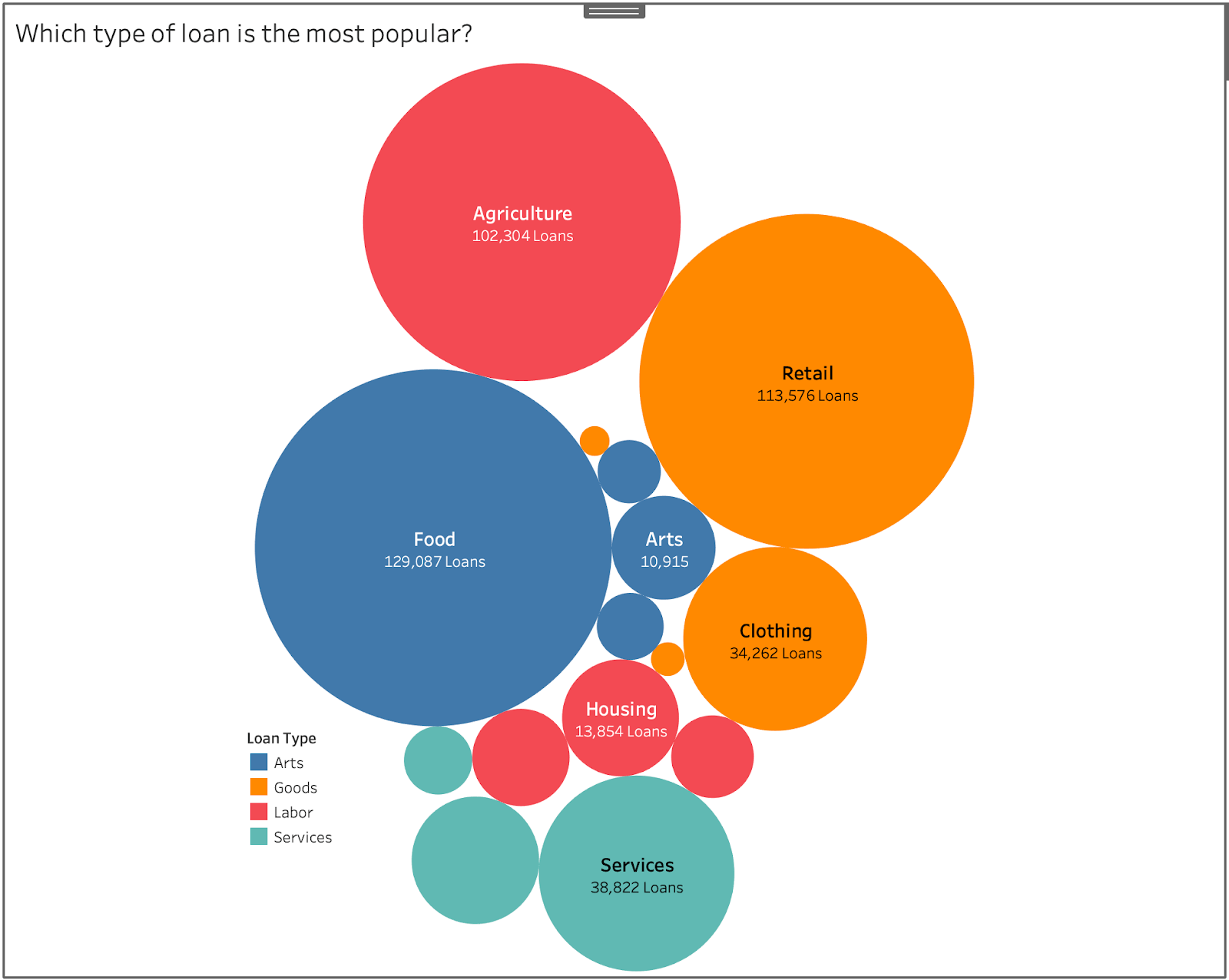
- Bubble Size: The size of each bubble corresponds to a third variable. Larger bubbles represent higher values, while smaller bubbles represent lower values. This allows you to quickly grasp the relative magnitude of this variable across different data points.
Furthermore, bubble charts often incorporate a fourth dimension through color:
- Bubble Color: Different colors can be assigned to bubbles based on a fourth categorical or continuous variable. This allows you to group bubbles based on shared characteristics or highlight trends within specific categories.
In some cases, even a fifth dimension can be added through:
- Bubble Shape: While less common, different shapes (e.g., squares, triangles) can represent a fifth categorical variable, further enriching the data representation.
When to Use a Bubble Chart (and When Not To)
Bubble charts excel in scenarios where you need to visualize the relationship between three or more variables and want to:
- Compare the magnitude of a third variable across different categories or points. They are excellent for highlighting which data points have the largest or smallest values for the variable represented by bubble size.
- Identify clusters and outliers. The visual representation makes it easy to spot groups of bubbles that are close together (indicating similar characteristics) or bubbles that are far away from the main cluster (indicating outliers).
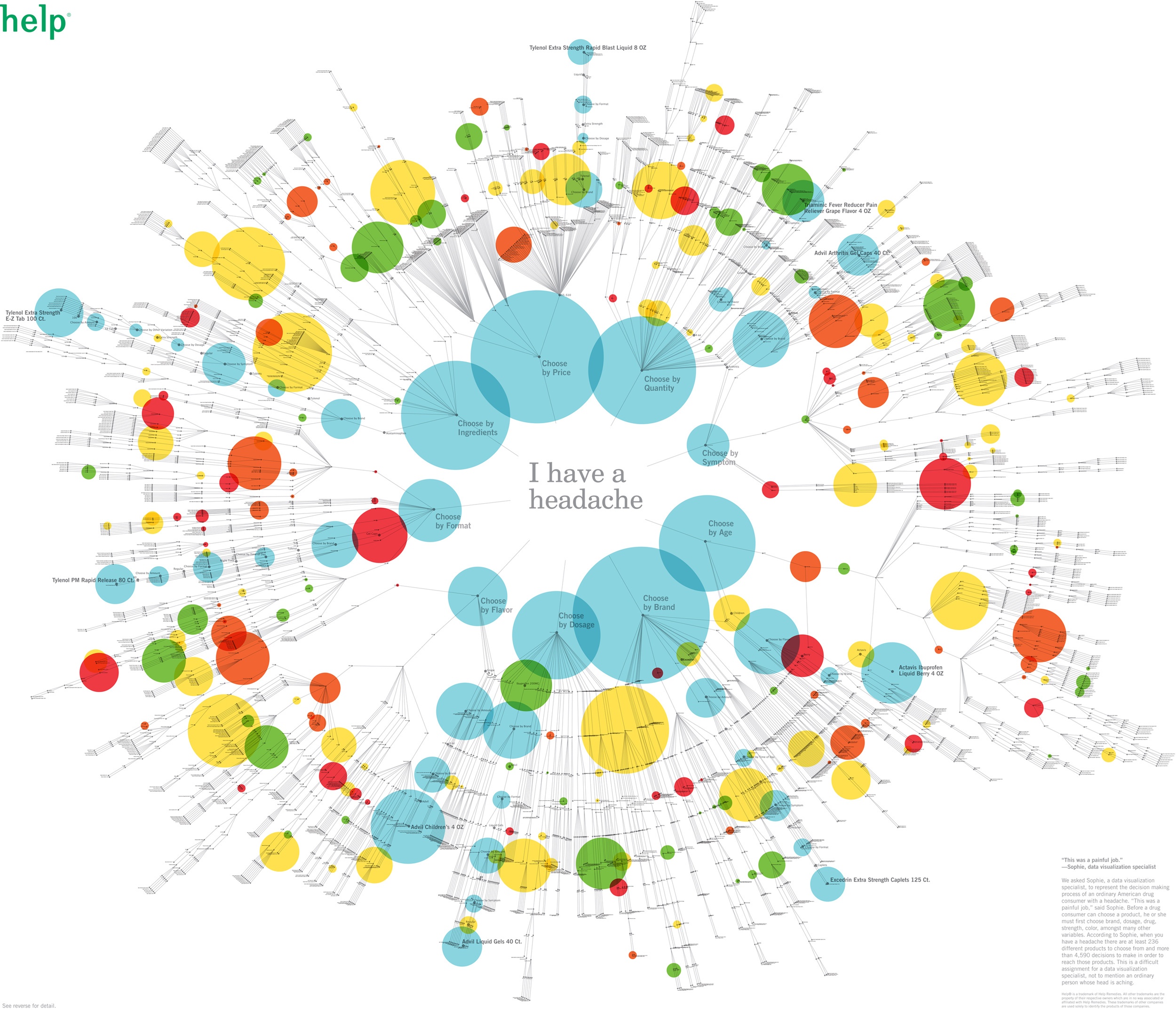
- Present data in a visually engaging and easily understandable way. Bubble charts are more appealing and memorable than simple tables or lists of numbers.
- Track changes over time. By using animation, bubble charts can effectively show how data points change over time across multiple dimensions. This is often referred to as a "motion chart."
However, bubble charts are not always the best choice. Consider these limitations:
- Complexity: Overcrowding with too many bubbles can make the chart cluttered and difficult to interpret.
- Accuracy: Bubble size perception is not always precise. It can be challenging to accurately compare the sizes of bubbles that are very similar in size.
- Negative Values: Representing negative values with bubble size can be problematic. It’s generally best to avoid using bubble charts when dealing with significant negative values.
- Misinterpretation: Without proper labeling and context, the relationships visualized in a bubble chart can be misinterpreted.
Best Practices for Creating Effective Bubble Charts
To ensure your bubble chart effectively communicates your data, follow these best practices:
-
Choose the Right Data: Select data that is relevant to your story and clearly demonstrates the relationships you want to highlight. The variables should have a meaningful connection.
-
Keep it Simple: Avoid overcrowding the chart with too many bubbles. Aim for a manageable number of data points to maintain clarity. Consider using filtering options if you have a large dataset.
-
Size Matters (and Should Be Clear): Ensure that the bubble sizes are proportional to the values they represent. Use a clear scaling system so that the audience can easily understand the magnitude represented by different bubble sizes. Clearly label the range of values associated with the smallest and largest bubbles.
-
Color with Purpose: Use color strategically to highlight categories or trends. Choose a color palette that is visually appealing and easy to distinguish. Avoid using too many colors, as this can make the chart confusing.
-
Label Everything: Clearly label the axes, bubbles (if space allows), and color categories. Provide a concise title that accurately describes the chart’s purpose. Use tooltips to provide additional information when hovering over a bubble.
-
Provide Context: Include a brief explanation of the data and the insights you want to convey. Consider adding annotations to highlight specific data points or trends.
-
Consider Transparency: Using transparency (alpha) for the bubbles can help to reduce visual clutter and allow you to see overlapping bubbles more clearly.
-
Test and Iterate: Get feedback from others on your bubble chart and make adjustments as needed. Ensure that the chart is easy to understand and effectively communicates the intended message.
Examples of Bubble Chart Applications
-
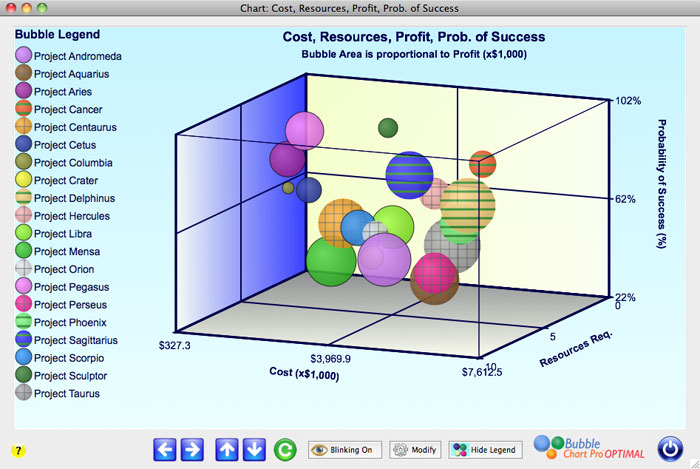
Sales Performance Analysis: X-axis: Sales Revenue, Y-axis: Customer Acquisition Cost, Bubble Size: Profit Margin, Bubble Color: Product Category. This chart can help identify which product categories are most profitable and efficient in terms of customer acquisition.
-
Market Analysis: X-axis: Market Share, Y-axis: Growth Rate, Bubble Size: Market Size, Bubble Color: Region. This chart can help identify promising markets with high growth potential and significant market size.
-
Project Portfolio Management: X-axis: Project Cost, Y-axis: Expected Return, Bubble Size: Project Risk, Bubble Color: Department. This chart can help prioritize projects based on their risk-reward profile and resource allocation.
-
Global Health Indicators: X-axis: Life Expectancy, Y-axis: GDP per Capita, Bubble Size: Population, Bubble Color: Continent. This chart can help compare the health and economic well-being of different countries.
-
Website Analytics: X-axis: Bounce Rate, Y-axis: Average Session Duration, Bubble Size: Page Views, Bubble Color: Traffic Source. This chart can help identify pages that are performing poorly and understand the behavior of users from different traffic sources.
Tools for Creating Bubble Charts
Many software tools offer bubble chart functionality, including:
- Microsoft Excel: A widely accessible tool for creating basic bubble charts.
- Google Sheets: A free, web-based spreadsheet program with bubble chart capabilities.
- Tableau: A powerful data visualization platform with advanced bubble chart options.
- Power BI: Another popular data visualization tool from Microsoft with robust features.
- Python (with libraries like Matplotlib, Seaborn, and Plotly): Offers highly customizable and interactive bubble chart creation.
- R (with libraries like ggplot2): A statistical computing language with extensive data visualization capabilities.
The choice of tool depends on your specific needs, budget, and technical expertise. Excel and Google Sheets are suitable for basic bubble charts, while Tableau, Power BI, and programming languages like Python and R offer more advanced features and customization options.
FAQ about Bubble Charts
-
Q: What is the difference between a scatter plot and a bubble chart?
- A: A scatter plot shows the relationship between two variables using points. A bubble chart extends this by adding a third variable represented by the size of the bubbles.
-
Q: How do I choose the right size for my bubbles?
- A: Ensure the area of the bubble is proportional to the value it represents. Many charting tools handle this automatically.
-
Q: Can I use negative values in a bubble chart?
- A: It’s generally not recommended to represent negative values with bubble size, as it can be confusing. Consider using a different chart type or transforming the data. If you must, use a different visual cue like color or a different quadrant of the chart.
-
Q: How many bubbles is too many in a bubble chart?
- A: There’s no magic number, but generally, more than 50 bubbles can start to become cluttered. Consider filtering or grouping your data to reduce the number of bubbles.
-
Q: What are some common mistakes to avoid when creating bubble charts?
- A: Overcrowding, inconsistent bubble sizing, lack of clear labels, and using inappropriate data are common mistakes.
-
Q: How can I make my bubble chart more interactive?
- A: Use tools that support interactive features like tooltips, zooming, and filtering. Consider creating a motion chart to show how data changes over time.
-
Q: What is a motion chart?
- A: A motion chart is a type of bubble chart that animates the movement of bubbles over time, allowing you to visualize how data changes across multiple dimensions dynamically.
Conclusion: Harnessing the Power of Bubble Charts
Bubble charts are a valuable addition to your data visualization toolkit. By effectively representing multiple dimensions of data, they can reveal hidden patterns, highlight important relationships, and communicate complex information in a clear and engaging way. By understanding their strengths and limitations, following best practices, and utilizing the right tools, you can leverage the power of bubble charts to gain deeper insights from your data and make more informed decisions. Remember to always prioritize clarity and context to ensure that your audience can easily understand and interpret the information presented. With careful planning and execution, bubble charts can transform raw data into compelling visual stories.

Leave a Reply