P1]
Bar charts, also known as bar graphs, are a ubiquitous visualization tool used to represent categorical data. They provide a clear and intuitive way to compare different groups, categories, or periods by displaying rectangular bars with lengths proportional to the values they represent. From simple sales figures to complex scientific findings, bar charts are a versatile and powerful method for communicating information effectively. This article delves into the intricacies of bar charts, exploring their types, construction, best practices, and applications.
Understanding the Fundamentals
At its core, a bar chart consists of two axes:
- Categorical Axis (X-axis): This axis displays the categories or groups being compared. These categories can be anything from product types to geographical locations to survey responses.
- Value Axis (Y-axis): This axis represents the numerical values associated with each category. The height (or length in horizontal bar charts) of each bar corresponds to the value for its respective category.
The key to understanding a bar chart lies in the relationship between the category and its corresponding value. The longer (or taller) the bar, the greater the value associated with that category. This visual representation allows for quick and easy comparisons, making bar charts a highly effective communication tool.
Types of Bar Charts
While the basic principle remains the same, bar charts come in several variations, each suited for specific data presentation needs:

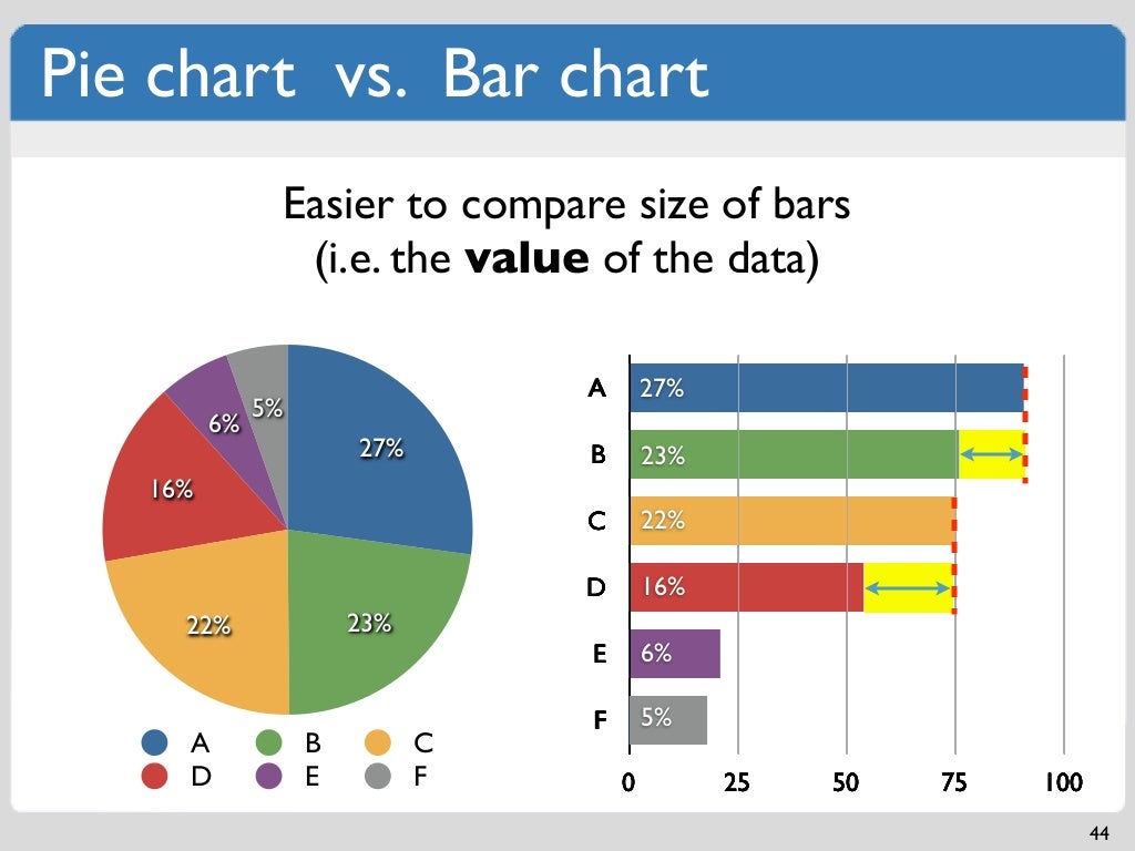
Vertical Bar Chart (Column Chart): This is the most common type, where bars are oriented vertically. It’s ideal for comparing discrete categories, showing trends over time, or displaying frequencies. Vertical bar charts are generally easier to read when categories are relatively short and the number of categories isn’t overly large.

Horizontal Bar Chart: In this variation, bars are oriented horizontally. Horizontal bar charts are particularly useful when dealing with long category names or when comparing a large number of categories. The horizontal layout provides more space for labels, improving readability.
Stacked Bar Chart: This type displays multiple categories within a single bar. Each bar is divided into segments, with the length of each segment representing the contribution of a specific sub-category to the overall total. Stacked bar charts are excellent for showing the composition of a whole and comparing the contribution of different components across categories. However, comparing the sizes of inner segments can be challenging, especially if they are of similar size.
Grouped Bar Chart (Clustered Bar Chart): This chart displays multiple bars for each category, allowing for comparisons within and between categories. Each group of bars represents a different sub-category, making it easier to compare values across multiple dimensions. Grouped bar charts are effective when comparing related data sets, but can become cluttered if too many sub-categories are displayed.
100% Stacked Bar Chart: This variation of the stacked bar chart displays the percentage contribution of each sub-category to the total for each category. All bars have the same length, representing 100%, and the segments within each bar show the proportion of each sub-category. 100% stacked bar charts are useful for comparing the relative proportions of different categories, rather than their absolute values.

Constructing Effective Bar Charts: Best Practices
Creating a clear and informative bar chart requires careful attention to detail. Here are some best practices to follow:
Clear and Concise Labels: Ensure that all axes, categories, and bars are clearly labeled. Use concise and descriptive labels that accurately represent the data. Avoid abbreviations or jargon that may be confusing to the audience.
Appropriate Scaling: Choose a scale for the value axis that accurately reflects the range of data. Avoid truncating the axis, as this can distort the visual representation and exaggerate differences between categories. Starting the axis at zero is generally recommended unless there is a specific reason to do otherwise.
Consistent Bar Width: Maintain consistent bar widths throughout the chart. Varying bar widths can be visually misleading and create a false impression of differing importance.
Logical Ordering: Arrange categories in a logical order, such as alphabetical, chronological, or by value (ascending or descending). This helps viewers quickly grasp the key insights from the data.
Effective Use of Color: Use color strategically to highlight specific categories or draw attention to important trends. Avoid using too many colors, as this can make the chart visually cluttered and difficult to interpret. Consider using colorblind-friendly palettes to ensure accessibility.
Whitespace and Spacing: Provide adequate whitespace between bars and categories to improve readability. Avoid overcrowding the chart with too much information.
**Descriptive

Leave a Reply