P1]
In today’s data-driven world, the ability to extract meaningful insights from vast datasets is paramount. While standard charts and graphs offer a foundational level of data exploration, they often fall short in conveying nuanced information or catering to specific analytical needs. This is where the power of custom visualization comes into play.
Custom visualization goes beyond pre-defined chart types, allowing users to craft bespoke visual representations that precisely address their unique questions and data characteristics. It’s about transforming raw data into compelling narratives, uncovering hidden patterns, and facilitating more informed decision-making. This article explores the realm of custom visualization, delving into its benefits, challenges, techniques, and applications, ultimately demonstrating its transformative potential for businesses and researchers alike.
Why Choose Custom Visualization?
Standard visualization tools offer a limited range of chart types, often forcing data to fit predefined templates. This can lead to:
- Oversimplification: Complex relationships might be lost in generic visualizations.
- Misinterpretation: Inappropriate chart types can distort data and lead to inaccurate conclusions.
- Lack of Context: Standard charts often lack the ability to incorporate specific contextual information crucial for understanding the data.
- Limited Storytelling: The ability to weave a compelling narrative around the data is often compromised.

Custom visualization addresses these limitations by providing the flexibility to:
- Tailor Visuals to Specific Data: Choose the most appropriate visual representation based on the data’s nature, dimensionality, and the questions being asked.
- Highlight Key Insights: Design visualizations that emphasize specific trends, outliers, and relationships, making them immediately apparent.
- Incorporate Contextual Information: Integrate external data sources, annotations, and interactive elements to provide a richer understanding of the data.
- Tell a Compelling Story: Craft visually engaging narratives that resonate with the audience and facilitate deeper understanding.
- Improve Communication: Communicate complex data insights clearly and effectively to both technical and non-technical audiences.

The Building Blocks of Custom Visualization
Creating custom visualizations involves a combination of technical skills, domain expertise, and creative design. Key elements include:
- Data Understanding: A thorough understanding of the data, including its structure, types, and potential biases, is crucial. This involves data exploration, cleaning, and transformation.
- Visualization Principles: A solid grasp of fundamental visualization principles, such as Gestalt principles of visual perception, color theory, and information hierarchy, is essential for creating effective and aesthetically pleasing visuals.
- Programming Languages and Libraries: Popular programming languages like Python (with libraries like Matplotlib, Seaborn, and Plotly) and JavaScript (with libraries like D3.js and Chart.js) provide the tools necessary to create custom visualizations.
- Data Visualization Tools: While custom coding provides maximum flexibility, data visualization tools like Tableau, Power BI, and Qlik Sense offer advanced customization options and scripting capabilities for creating more sophisticated visuals.
- User Interface (UI) Design: For interactive visualizations, a well-designed UI is crucial for user engagement and exploration. This involves considering factors like navigation, filtering, and interactivity.
Techniques and Approaches to Custom Visualization
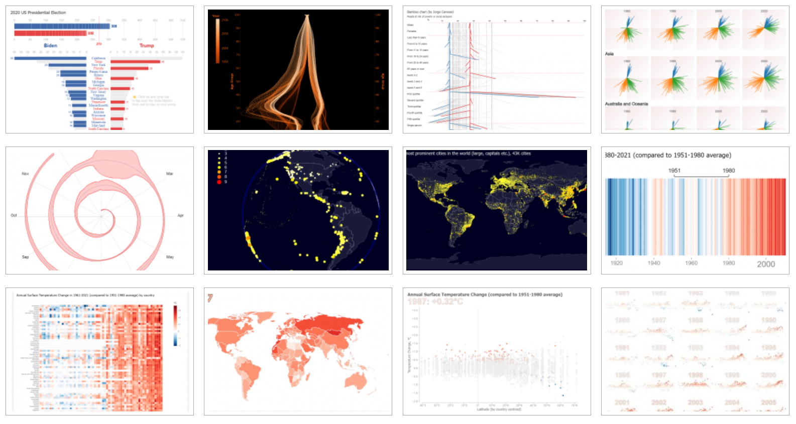
The possibilities for custom visualization are virtually limitless. Here are a few examples of techniques and approaches:
- Network Graphs: Visualizing relationships between entities, such as social networks, supply chains, or knowledge graphs. These graphs can reveal clusters, influencers, and hidden connections.
- Geospatial Visualizations: Mapping data onto geographical maps, such as choropleth maps, heatmaps, or point maps, to reveal spatial patterns and trends.
- Interactive Dashboards: Creating interactive dashboards that allow users to explore data from multiple perspectives, drill down into details, and filter data based on their specific interests.
- 3D Visualizations: Representing data in three dimensions to reveal complex relationships and structures, particularly useful in fields like medical imaging, engineering, and architecture.
- Animated Visualizations: Using animation to illustrate changes over time or to guide users through complex data narratives.
- Infographics: Combining data visualizations with text, images, and other design elements to create visually appealing and informative presentations.
- Custom Chart Types: Designing entirely new chart types that are tailored to the specific data and analytical goals. This can involve modifying existing chart types or creating entirely novel visual representations.
- Augmented Reality (AR) and Virtual Reality (VR) Visualizations: Immersing users in interactive data environments, allowing them to explore data in a more intuitive and engaging way.
Applications of Custom Visualization Across Industries
Custom visualization finds applications across a wide range of industries and domains:
- Healthcare: Visualizing patient data, tracking disease outbreaks, and analyzing treatment outcomes.
- Finance: Detecting fraudulent transactions, identifying investment opportunities, and monitoring market trends.
- Marketing: Analyzing customer behavior, optimizing marketing campaigns, and personalizing customer experiences.
- Supply Chain Management: Tracking inventory levels, optimizing logistics, and identifying bottlenecks.
- Scientific Research: Visualizing experimental data, simulating complex systems, and exploring scientific phenomena.
- Education: Creating interactive learning tools, visualizing complex concepts, and engaging students in data exploration.
- Government: Monitoring public health, tracking crime rates, and analyzing economic trends.
Challenges and Considerations
While custom visualization offers significant advantages, it also presents certain challenges:
- Complexity: Creating custom visualizations can be technically challenging, requiring expertise in programming, data analysis, and visualization principles.
- Development Time: Custom visualization projects can be time-consuming, requiring significant effort in data preparation, design, and implementation.
- Maintainability: Custom visualizations can be difficult to maintain and update, particularly if they are not well-documented or if the underlying data sources change.
- Scalability: Custom visualizations may not scale well to large datasets or complex analytical tasks.
- Accessibility: Ensuring that custom visualizations are accessible to users with disabilities requires careful consideration of factors like color contrast, screen reader compatibility, and alternative text descriptions.
- Ethical Considerations: Visualizations can be used to manipulate or mislead audiences. It’s crucial to ensure that visualizations are accurate, unbiased, and ethically sound.
Best Practices for Effective Custom Visualization
To maximize the effectiveness of custom visualizations, consider the following best practices:
- Define Clear Objectives: Clearly define the goals of the visualization and the questions you want to answer.
- Understand Your Audience: Tailor the visualization to the knowledge and needs of your target audience.
- Choose the Right Visual Representation: Select the most appropriate visual representation based on the data’s nature and the insights you want to convey.
- Keep it Simple: Avoid clutter and unnecessary complexity. Focus on highlighting the key insights.
- Use Color Effectively: Use color strategically to highlight important data points and create visual hierarchy.
- Provide Context: Incorporate contextual information to provide a richer understanding of the data.
- Ensure Accuracy: Double-check the accuracy of the data and the visualization.
- Test and Iterate: Test the visualization with users and iterate based on their feedback.
- Document Your Work: Document the design process, data sources, and code used to create the visualization.
FAQ: Custom Visualization
- Q: What is the difference between standard and custom visualization?
- A: Standard visualization uses pre-defined chart types, while custom visualization allows you to create bespoke visual representations tailored to your specific data and analytical needs.
- Q: Do I need to be a programmer to create custom visualizations?
- A: While programming skills are helpful, some data visualization tools offer advanced customization options and scripting capabilities that allow you to create custom visualizations without extensive coding.
- Q: What are the best programming languages for custom visualization?
- A: Python (with libraries like Matplotlib, Seaborn, and Plotly) and JavaScript (with libraries like D3.js and Chart.js) are popular choices for custom visualization.
- Q: How can I make my custom visualizations more accessible?
- A: Use sufficient color contrast, provide alternative text descriptions for images, and ensure that the visualization is compatible with screen readers.
- Q: What are some common mistakes to avoid when creating custom visualizations?
- A: Avoid clutter, use color effectively, ensure accuracy, and tailor the visualization to your audience.
- Q: Where can I learn more about custom visualization?
- A: Online courses, tutorials, and books on data visualization, programming, and UI design can provide valuable insights.
Conclusion: Embracing the Future of Data Exploration
Custom visualization is more than just creating pretty charts; it’s about empowering users to unlock the full potential of their data. By going beyond standard visualizations, businesses and researchers can gain deeper insights, communicate more effectively, and make more informed decisions. While custom visualization requires technical expertise and careful planning, the rewards are well worth the effort. As data continues to grow in volume and complexity, the ability to create custom visualizations will become increasingly critical for success in the data-driven world. Embracing the power of custom visualization is not just about staying ahead of the curve; it’s about shaping the future of data exploration.

Leave a Reply