P1]
In today’s data-rich environment, the ability to quickly understand complex information is paramount. This is where dashboards come in. A dashboard, in its essence, is a visual display of the most important information needed to achieve one or more objectives; consolidated and arranged on a single screen so the information can be monitored at a glance. They provide a powerful tool for tracking performance, identifying trends, and making informed decisions across various industries and departments.
This article will delve into the world of dashboards, exploring their purpose, components, design principles, different types, and the benefits they offer. We’ll also discuss the challenges involved in creating effective dashboards and provide insights into best practices for maximizing their impact.
What is a Dashboard and Why is it Important?
Imagine trying to navigate a complex city without a map or GPS. You’d likely get lost, waste time, and struggle to reach your destination. Similarly, in the business world, trying to manage operations without a clear overview of key performance indicators (KPIs) can be equally frustrating and inefficient.
Dashboards provide that crucial overview. They are visual representations of data that allow users to quickly grasp the current state of affairs, identify potential problems, and make timely decisions. Instead of wading through endless spreadsheets and reports, users can simply glance at a well-designed dashboard to understand what’s happening and where their attention is needed.
The importance of dashboards stems from several key factors:
- Improved Decision Making: By presenting data in a clear and concise format, dashboards enable users to make more informed decisions based on real-time information.
- Enhanced Performance Monitoring: Dashboards allow organizations to track progress towards goals, identify areas of strength and weakness, and take corrective action when necessary.
- Increased Efficiency: By consolidating key information into a single view, dashboards eliminate the need for manual data gathering and analysis, freeing up time for more strategic activities.
- Better Communication: Dashboards facilitate communication across teams and departments by providing a common understanding of key performance metrics.
- Proactive Problem Solving: By highlighting potential issues early on, dashboards enable organizations to address problems before they escalate.

Key Components of a Dashboard:
A well-designed dashboard typically includes the following key components:
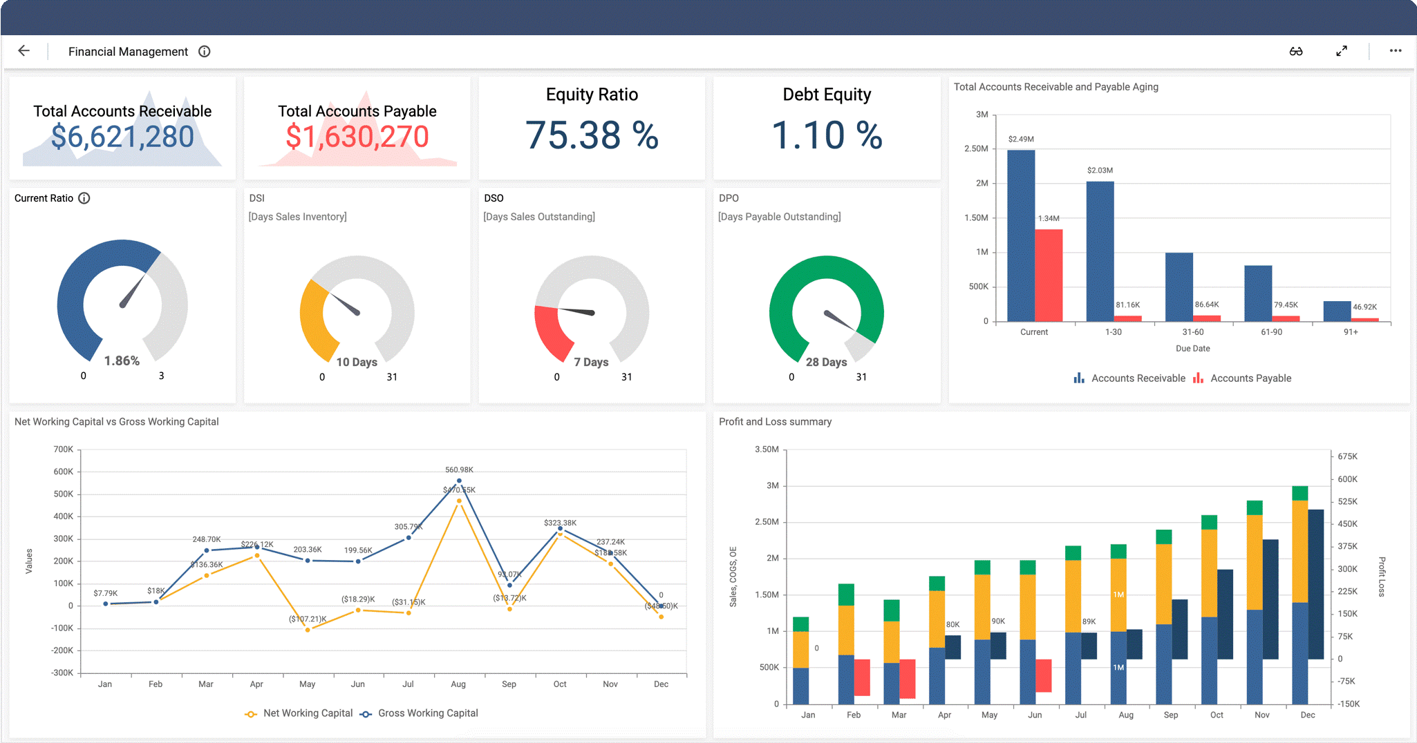
- KPIs (Key Performance Indicators): These are the critical metrics that reflect the performance of a specific business function or objective. Examples include sales revenue, customer satisfaction, website traffic, and production output.
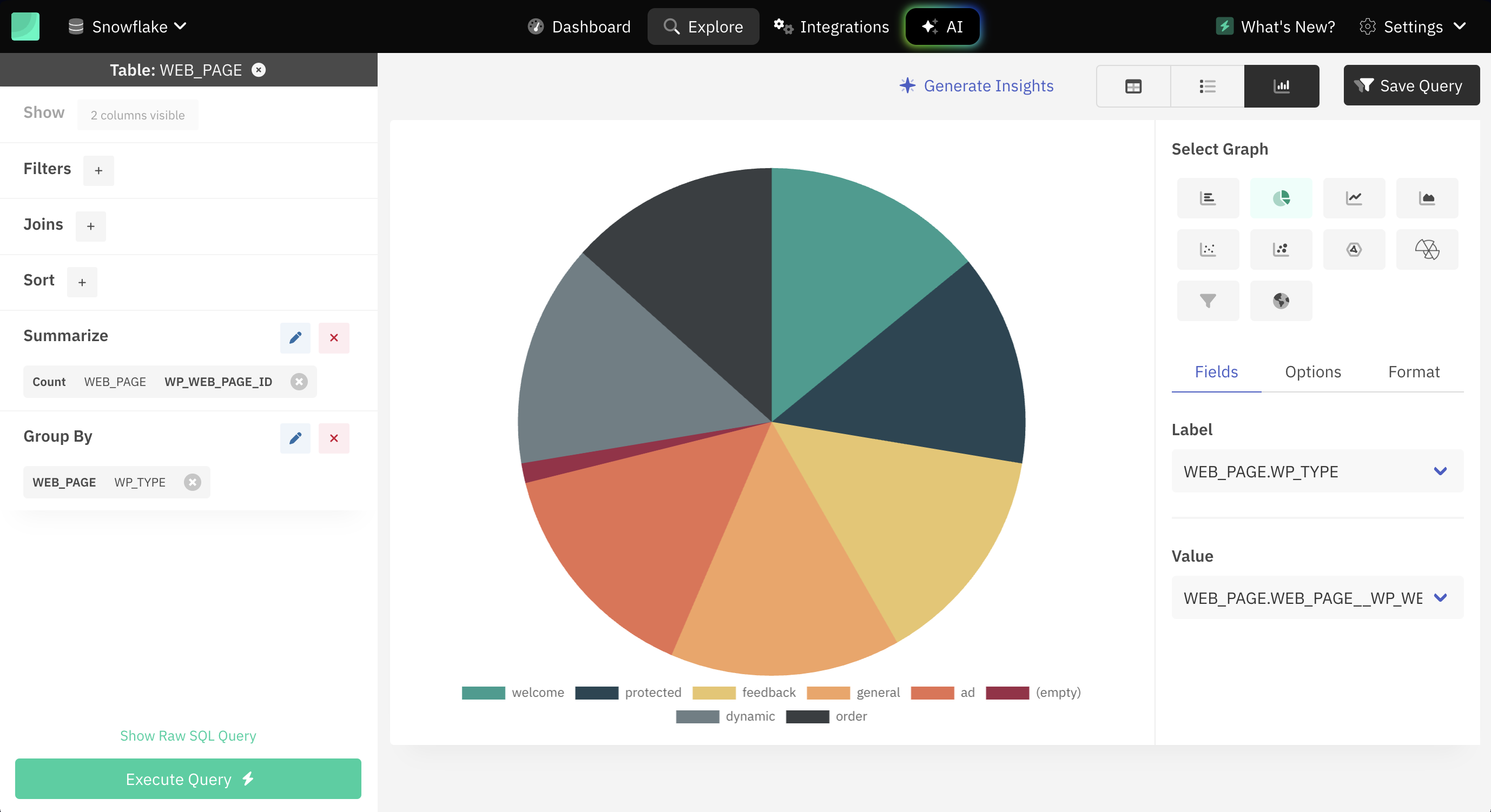
- Charts and Graphs: Visual representations of data that make it easier to identify trends, patterns, and outliers. Common chart types include bar charts, line charts, pie charts, and scatter plots.
- Gauges and Meters: Visual indicators that show the current status of a KPI in relation to a target or goal.
- Tables and Lists: Used to display detailed data in a structured format.
- Alerts and Notifications: Automated messages that notify users when a KPI falls outside of acceptable limits or when a specific event occurs.
- Filters and Controls: Allow users to drill down into specific data segments and customize the view of the dashboard.
- Contextual Information: Provides relevant background information and explanations to help users understand the data being presented.

Design Principles for Effective Dashboards:
Creating an effective dashboard requires careful planning and attention to detail. Here are some key design principles to keep in mind:
- Define the Purpose: Clearly identify the objectives of the dashboard and the target audience. What questions should the dashboard answer? What decisions will it inform?
- Focus on Key Metrics: Avoid overwhelming users with too much information. Select only the most relevant KPIs that are critical to achieving the dashboard’s objectives.
- Choose the Right Visualizations: Select chart types that are appropriate for the data being presented and that effectively communicate the intended message.
- Keep it Simple and Clean: Avoid clutter and unnecessary distractions. Use a clear and consistent layout, color scheme, and typography.
- Prioritize Information: Arrange the most important information in a prominent location, such as the top left corner of the screen.
- Ensure Data Accuracy: Use reliable data sources and implement quality control measures to ensure that the information displayed on the dashboard is accurate and up-to-date.
- Provide Context: Include relevant background information and explanations to help users understand the data being presented.
- Make it Interactive: Allow users to drill down into specific data segments and customize the view of the dashboard.
- Test and Iterate: Gather feedback from users and make adjustments to the dashboard based on their needs and preferences.
Types of Dashboards:
Dashboards can be categorized based on their purpose and target audience. Here are some common types:
- Strategic Dashboards: Provide a high-level overview of key performance indicators for senior management. They focus on long-term trends and strategic goals.
- Tactical Dashboards: Focus on monitoring the performance of specific business units or departments. They provide more detailed information than strategic dashboards and are used for tactical decision-making.
- Operational Dashboards: Provide real-time information about day-to-day operations. They are used by front-line employees to monitor performance and identify potential problems.
- Analytical Dashboards: Used for in-depth data analysis and exploration. They provide users with the ability to drill down into specific data segments and identify patterns and trends.
Benefits of Using Dashboards:
The benefits of implementing dashboards are numerous and can significantly impact an organization’s performance. These benefits include:
- Improved Visibility: Dashboards provide a clear and concise view of key performance indicators, allowing users to quickly understand the current state of affairs.
- Faster Decision Making: By providing real-time information, dashboards enable users to make more informed decisions quickly.
- Increased Efficiency: Dashboards automate the process of data gathering and analysis, freeing up time for more strategic activities.
- Enhanced Collaboration: Dashboards facilitate communication and collaboration across teams and departments by providing a common understanding of key performance metrics.
- Better Alignment: Dashboards help align individual and team goals with the overall objectives of the organization.
- Proactive Problem Solving: By highlighting potential issues early on, dashboards enable organizations to address problems before they escalate.
- Improved Accountability: Dashboards provide a clear record of performance, making it easier to hold individuals and teams accountable for their results.
- Data-Driven Culture: By making data more accessible and understandable, dashboards help foster a data-driven culture within the organization.
Challenges in Creating Effective Dashboards:
While dashboards offer numerous benefits, creating effective dashboards can be challenging. Some common challenges include:
- Defining Clear Objectives: Without a clear understanding of the dashboard’s purpose and target audience, it’s difficult to select the right KPIs and design an effective layout.
- Selecting the Right Metrics: Choosing the wrong KPIs can lead to misleading or irrelevant information.
- Data Quality Issues: Inaccurate or incomplete data can undermine the credibility of the dashboard and lead to poor decision-making.
- Overwhelming Users with Too Much Information: A cluttered and complex dashboard can be difficult to understand and use.
- Lack of User Adoption: If users don’t find the dashboard useful or easy to use, they may not adopt it.
- Technical Complexity: Creating and maintaining dashboards can require significant technical expertise.
Best Practices for Maximizing Dashboard Impact:
To overcome these challenges and maximize the impact of dashboards, consider the following best practices:
- Involve Users in the Design Process: Gather feedback from users throughout the design process to ensure that the dashboard meets their needs and preferences.
- Keep it Simple and Focused: Avoid clutter and unnecessary distractions. Focus on the most important KPIs and use clear and concise visualizations.
- Use a Consistent Design Language: Use a consistent layout, color scheme, and typography to create a visually appealing and easy-to-understand dashboard.
- Provide Context and Explanations: Include relevant background information and explanations to help users understand the data being presented.
- Regularly Review and Update the Dashboard: Ensure that the dashboard remains relevant and useful by regularly reviewing and updating it based on user feedback and changing business needs.
- Invest in Training and Support: Provide users with the training and support they need to effectively use the dashboard.
- Promote the Use of Dashboards: Encourage users to incorporate dashboards into their daily workflows.
Conclusion:
Dashboards are powerful tools for visualizing data and making informed decisions. By providing a clear and concise overview of key performance indicators, dashboards enable organizations to track progress, identify trends, and take corrective action when necessary. While creating effective dashboards can be challenging, by following the design principles and best practices outlined in this article, organizations can maximize the impact of their dashboards and drive significant improvements in performance. In today’s data-driven world, mastering the art of dashboard design is essential for success.
FAQ about Dashboards:
Q: What is the difference between a dashboard and a report?
A: A dashboard is a visual display of key performance indicators (KPIs) designed to be viewed at a glance. It focuses on providing a high-level overview of performance and identifying trends. A report, on the other hand, is a more detailed document that presents data in a structured format. Reports often contain tables, charts, and textual analysis. Dashboards are typically interactive, allowing users to drill down into specific data segments, while reports are often static.
Q: What tools can I use to create dashboards?
A: There are many dashboarding tools available, ranging from simple spreadsheet programs to sophisticated business intelligence platforms. Some popular options include:
- Microsoft Excel: A versatile spreadsheet program that can be used to create basic dashboards.
- Google Sheets: A cloud-based spreadsheet program that offers similar functionality to Excel.
- Tableau: A powerful data visualization and business intelligence platform.
- Power BI: Microsoft’s business intelligence platform, offering similar capabilities to Tableau.
- Kibana: An open-source data visualization platform that works well with Elasticsearch.
- Grafana: Another popular open-source data visualization platform, often used for monitoring infrastructure and applications.
Q: How often should I update my dashboard?
A: The frequency of updates depends on the nature of the data being displayed and the needs of the users. Operational dashboards that track real-time data may need to be updated continuously, while strategic dashboards that focus on long-term trends may only need to be updated monthly or quarterly.
Q: How do I choose the right KPIs for my dashboard?
A: The KPIs you choose should be aligned with the objectives of the dashboard and the needs of the target audience. Consider the following factors when selecting KPIs:
- Relevance: Are the KPIs relevant to the goals and objectives of the business?
- Measurability: Can the KPIs be easily measured and tracked?
- Actionability: Can users take action based on the information provided by the KPIs?
- Clarity: Are the KPIs easy to understand and interpret?
Q: How can I improve user adoption of my dashboard?
A: To improve user adoption, focus on creating a dashboard that is user-friendly, relevant, and valuable. Involve users in the design process, provide training and support, and regularly review and update the dashboard based on user feedback.
Q: Is it possible to have too many dashboards?
A: Yes, it is. Having too many dashboards can lead to information overload and make it difficult for users to find the information they need. It’s important to consolidate dashboards where possible and focus on creating a limited number of high-quality dashboards that provide the most valuable insights.
Q: What is the role of mobile dashboards?
A: Mobile dashboards are designed to be viewed on smartphones and tablets. They provide users with the ability to access key information and make decisions on the go. Mobile dashboards should be optimized for smaller screens and touch interfaces.
Conclusion:
In conclusion, dashboards are essential tools for modern businesses seeking to leverage data for informed decision-making and improved performance. By understanding the principles of effective dashboard design, selecting appropriate KPIs, and utilizing the right tools, organizations can create powerful visualizations that provide valuable insights and drive positive outcomes. As data continues to grow in volume and complexity, the ability to create and interpret dashboards will become increasingly critical for success in the competitive business landscape. Embrace the power of visualization and unlock the potential of your data with well-designed and insightful dashboards.
Leave a Reply